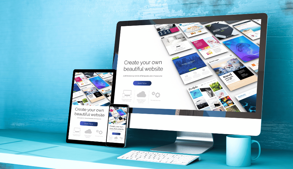
According to Statista, as of 2023, over 59% of global website traffic comes from mobile devices. With more users accessing the web on smartphones and tablets, businesses need to ensure that their websites are optimized for all platforms. Responsive design plays a pivotal role in meeting this demand and has several key benefits:
1. Enhanced User Experience
A positive user experience is critical for keeping visitors on your website. With responsive design, users don’t have to deal with awkward layouts, zooming, or excessive scrolling. Instead, the website automatically adjusts to fit the screen size, making navigation smooth and content easy to read. This encourages visitors to stay longer, and interact with the site, and ultimately leads to higher engagement rates.
2. Improved SEO Performance
Search engines, particularly Google, prioritize mobile-friendly websites in search rankings. In 2015, Google rolled out its mobile-first indexing update, which means that it primarily uses the mobile version of a site for indexing and ranking purposes. Responsive design ensures that your website meets Google’s mobile-friendly standards, helping to improve your SEO and increase your chances of appearing higher in search results.
3. Cost-Efficiency and Time-Saving
Maintaining separate desktop and mobile websites requires more resources and can be time-consuming. With responsive design, you only need one website that works across all devices, which reduces development costs and maintenance time. This streamlined approach ensures that updates are made only once and are instantly reflected across all platforms.
4. Future-Proofing Your Website
Technology is always evolving, and new devices are constantly entering the market. With responsive design, your website will be able to adapt to any new device or screen size, ensuring that it remains functional and visually appealing in the future. This future-proofing capability is crucial for staying ahead in a fast-paced digital environment.
How Does Responsive Design Work?
To understand how responsive design works, let’s break down some of the core elements that make it possible.
1. Fluid Grids
In responsive design, a fluid grid system is used instead of fixed layouts. This grid system allows the website’s content to resize proportionally, rather than relying on fixed dimensions. Elements such as images, text, and navigation bars are placed within a grid that can expand or contract based on the size of the screen.
2. Flexible Images
Images play a vital role in the visual appeal of a website. In responsive design, images are made flexible, meaning they automatically adjust their size to fit the screen. CSS (Cascading Style Sheets) is often used to scale images and ensure that they don’t exceed the dimensions of the device’s screen. This prevents users from experiencing stretched or distorted visuals.
3. CSS Media Queries
CSS media queries are a fundamental part of responsive design. They allow the website to apply different CSS styles depending on the characteristics of the device, such as screen resolution, orientation (portrait or landscape), and viewport size. By defining breakpoints (specific screen widths), media queries can change the layout, font size, image scaling, and other design elements based on the screen size. For example, a website might display a multi-column layout on a desktop but switch to a single-column layout on a mobile device for better readability.
4. Viewport Meta Tag
The viewport meta tag is a simple yet essential tool for responsive design. It instructs the browser on how to adjust the website’s scale and dimensions to match the width of the device’s screen. Without this tag, mobile browsers may default to displaying the desktop version of a website, making the page appear zoomed out and difficult to navigate.
Key Features of a Successful Responsive Website
A well-designed responsive website should include the following features to ensure optimal performance and user satisfaction:
1. Fast Loading Speeds
Mobile users tend to be more impatient than desktop users, so having a fast-loading website is critical. By optimizing images, using lightweight code, and reducing HTTP requests, businesses can improve page load times. A slow website can lead to high bounce rates, negatively impacting user experience and SEO.
2. Touch-Friendly Navigation
With the majority of mobile users navigating websites via touchscreens, it’s essential to design touch-friendly elements such as buttons, menus, and forms. Buttons should be large enough to tap easily, and navigation menus should be simplified to accommodate smaller screens.
3. Readable Text
Text on a responsive website should automatically adjust to the screen size, ensuring readability without the need for zooming. CSS can be used to set relative font sizes (e.g., percentages or em units) instead of absolute sizes (e.g., pixels), making the text scalable across different devices.
4. Accessible Content
All content, including images, videos, and text, should be easily accessible and functional across all devices. Ensuring that interactive elements such as forms, sliders, and carousels work on both desktop and mobile platforms is crucial for maintaining a consistent user experience.
5. Cross-Browser Compatibility
Responsive websites should function properly across different browsers (e.g., Chrome, Firefox, Safari) and operating systems (iOS, Android, Windows). Cross-browser testing is vital to ensure that the design remains consistent regardless of the user’s platform.
The Impact of Responsive Design on Conversions
A well-implemented responsive design can significantly improve a business’s conversion rates. By ensuring that users have a seamless experience regardless of the device they’re using, businesses can reduce friction and encourage users to take desired actions, whether that’s signing up for a newsletter, making a purchase, or filling out a contact form.
1. Increased Engagement
When users have a positive experience on a website, they are more likely to engage with the content and return in the future. Responsive design creates an intuitive, user-friendly environment, leading to increased time on site, lower bounce rates, and higher engagement.
2. Higher Conversion Rates
A smooth, hassle-free experience is crucial for converting visitors into customers. If users can easily navigate the site, find the information they need, and complete tasks on any device, they are more likely to follow through with a purchase or inquiry.
3. Reduced Bounce Rates
A high bounce rate can be a sign that users are frustrated with the website, often due to poor design or slow loading times. Responsive design helps to reduce bounce rates by ensuring that users have a smooth, enjoyable experience across all devices, keeping them on the site longer.
Responsive Design and SEO: A Winning Combination
As mentioned earlier, responsive design is not just about improving user experience—it also plays a critical role in search engine optimization (SEO). Search engines like Google prioritize mobile-friendly websites, and responsive design is the best way to ensure your website meets these criteria. Here’s how responsive design can improve your SEO efforts:
1. Single URL for All Devices
With responsive design, you only need one URL for all devices. This is beneficial for SEO because it consolidates your website’s authority and reduces the risk of duplicate content, which can negatively impact rankings.
2. Improved Mobile Search Rankings
Google’s mobile-first indexing means that the mobile version of your site is the primary version considered for search engine rankings. A responsive website will automatically meet mobile-friendly standards, helping your site rank higher in mobile search results.
3. Faster Page Load Times
Google considers page speed as a ranking factor, especially for mobile searches. Responsive websites are typically faster because they use optimized images, CSS, and HTML to ensure quick load times, which improves SEO.
How Digi Tech Resource Group, LLC Can Help
At Digi Tech Resource Group, LLC, we specialize in creating responsive, high-performing websites that cater to the needs of multi-device users. Our expert team based in New York offers tailored web design services to help businesses stay competitive in today’s digital landscape. By using cutting-edge technologies and best practices, we ensure that your website is optimized for any device, improving user experience, SEO performance, and conversion rates.
Whether you’re a small business looking to attract local customers or a large enterprise aiming for a global audience, Digi Tech Resource Group, LLC has the expertise to create a responsive website that meets your specific needs. Contact us today to learn more about how we can help you adapt to the era of multi-device users and take your business to the next level.
Conclusion
In the age of multi-device users, having a responsive website is essential for providing a seamless user experience and staying competitive in the online marketplace. By optimizing for all devices, improving SEO performance, and enhancing user engagement, businesses can maximize their online presence and drive conversions. Responsive design is not just a trend – it’s the future of web development. With the expert services offered by Digi Tech Resource Group, LLC in New York, your business can ensure that its website is fully equipped to meet the demands of today’s diverse and ever-growing digital audience.